
【python】matplotlib生成散点矩阵图
数据贴后面,先上代码:
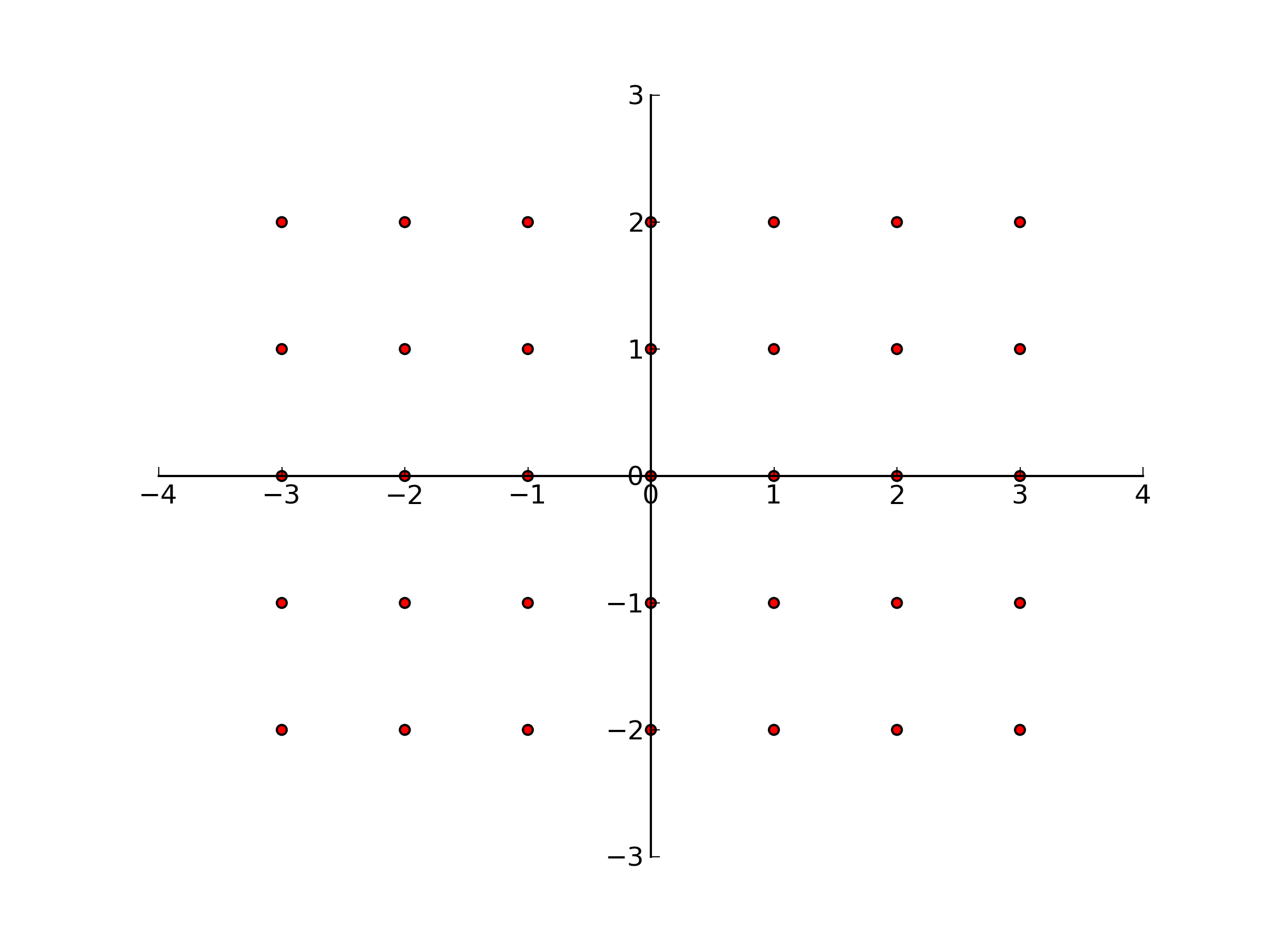
比较简单就不解释了。
# scatter

import numpy as np
import matplotlib.pyplot as plt

data = np.loadtxt("scatterData.txt")

X = [-3, -2, -1, 0, 1, 2, 3]
Y = [-2, -1, 0, 1, 2]

plt.scatter(data[:,0], data[:,1], c="r")

#move the spines to center
ax = plt.gca()
ax.spines["right"].set_color("none")
ax.spines["top"].set_color("none")
ax.xaxis.set_ticks_position("bottom")
ax.spines["bottom"].set_position(("data",0))
ax.yaxis.set_ticks_position("left")
ax.spines["left"].set_position(("data",0))

#export the picture
plt.savefig("scatter.png", dpi = 300)
plt.show()
scatterData.txt里面的数据:
-3  -2
-2  -2
-1  -2
0   -2
1   -2
2   -2
3   -2
-3  -1
-2  -1
-1  -1
0   -1
1   -1
2   -1
3   -1
-3  0
-2  0
-1  0
0   0
1   0
2   0
3   0
-3  1
-2  1
-1  1
0   1
1   1
2   1
3   1
-3  2
-2  2
-1  2
0   2
1   2
2   2
3   2
2016.04.24更新
忘了把上面的画贴出来了,补上:
声明:该文观点仅代表作者本人,牛骨文系教育信息发布平台,牛骨文仅提供信息存储空间服务。