
【Tensorflow】辅助工具篇——matplotlib介绍(中)
一.进阶绘图
等高线
等高线图经常用来表示一个二元函数z=f(x,y),我们可以形象的用一张网格图上面的点的函数值来描述。
#%matplotlib inline
import matplotlib.pyplot as plt
import numpy as np
def f(x, y):
return np.sin(x) ** 10 + np.cos(10 + y * x) * np.cos(x)
x = np.linspace(0, 5, 50)
y = np.linspace(0, 5, 40)
X, Y = np.meshgrid(x, y)
Z = f(X, Y)
print x.shape,X.shape,y.shape,Y.shape
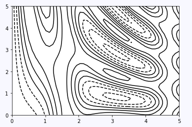
plt.contour(X, Y, Z, colors="black")如上,可以看到x为长50的向量,y为长40的向量,经过np.meshgrid处理后,形成X,Y大小都为(40,50)的二维数组,这样每一个网格点上都有一组(x,y)来赋值。
最后得到的图需要注意:使用单一颜色时,负值由虚线表示,正值由实线表示。
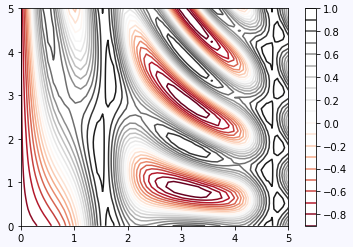
同时我们还可以控制线的密度和colorbar的显示
plt.contour(X, Y, Z, 20, cmap="RdGy")
plt.colorbar()
二维直方图
我们上节已经说了,直方图不仅可以统计单个变量的分布,甚至可以统计联合分布。用numpy生成一个二元高斯分布
mean = [0, 0]
cov = [[1, 1], [1, 2]]
x, y = np.random.multivariate_normal(mean, cov, 10000).T
print x.shape,y.shape
ok,这里x,y都是长10000的向量,
plt.hist2d(x, y, bins=100, cmap="Blues")
cb = plt.colorbar()
cb.set_label("counts in bin")
用hist2d来绘图,依然是统计落入划定区域的点数,这里bins设置为100,这个值可以看做分辨率
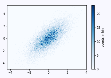
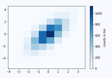
由上图可以看出越深的区域,这个分布出现的概率越大。当调小bins会出现萨满效果呢?如下图:
此时bins=10,可以看看效果
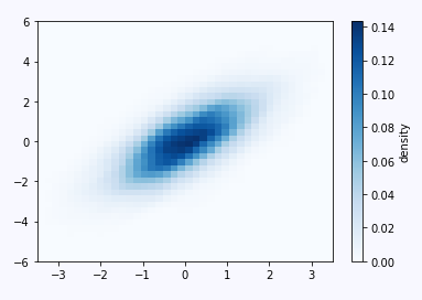
我们通过一个例子来做概率密度估计,使用的方法是scipy中的核密度估计,核密度估计(KDE)是评估多维度密度的另一种常用方法。我们直接跳过理论,展示它的实现方法:
from scipy.stats import gaussian_kde

# fit an array of size [Ndim, Nsamples]
data = np.vstack([x, y])
kde = gaussian_kde(data)

# evaluate on a regular grid
xgrid = np.linspace(-3.5, 3.5, 40)
ygrid = np.linspace(-6, 6, 40)
Xgrid, Ygrid = np.meshgrid(xgrid, ygrid)
Z = kde.evaluate(np.vstack([Xgrid.ravel(), Ygrid.ravel()]))

# Plot the result as an image
plt.imshow(Z.reshape(Xgrid.shape),
           origin="lower", aspect="auto",
           extent=[-3.5, 3.5, -6, 6],
           cmap="Blues")
cb = plt.colorbar()
cb.set_label("density")
二.添加子图
接下来我们说一说添加子图的一些技巧。以前我们添加子图的方式是plt.subplot,除了这种方式,也可以用axes函数来手动添加子图:
其中[]中的四个数分别表示[left, bottom, width, height]
ax1 = plt.axes()  # standard axes
ax2 = plt.axes([0.65, 0.65, 0.2, 0.2])
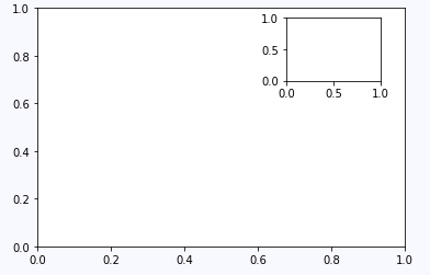
另外也可以通过add_axes()来添加子图
fig = plt.figure()
ax1 = fig.add_axes([0.1, 0.5, 0.8, 0.4],
                   xticklabels=[], ylim=(-1.2, 1.2))
ax2 = fig.add_axes([0.1, 0.1, 0.8, 0.4],
                   ylim=(-1.2, 1.2))

x = np.linspace(0, 10)
ax1.plot(np.sin(x))
ax2.plot(np.cos(x))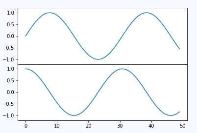
这里的[]又是什么含义呢,我们改一下它的值可能看的更加直观一些
fig = plt.figure()
ax1 = fig.add_axes([0.1, 0.8, 1, 0.4],
                   xticklabels=[], ylim=(-1.2, 1.2))
ax2 = fig.add_axes([0.4, 0.1, 0.8, 0.4],
                   ylim=(-1.2, 1.2))

x = np.linspace(0, 10)
ax1.plot(np.sin(x))
ax2.plot(np.cos(x))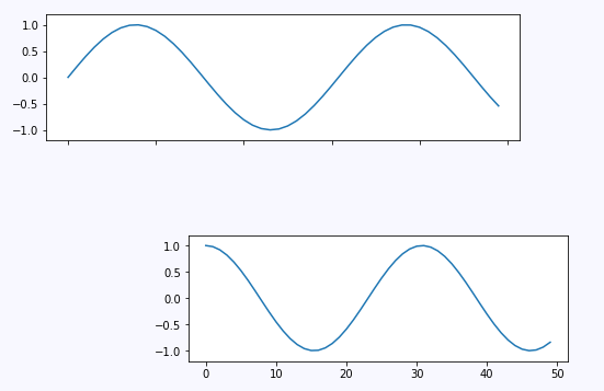
绘制子图的高级工具,plt.GridSpec()
要超越常规网格到跨多行和多列的子图,plt.GridSpec()是最好的工具。plt.GridSpec()对象本身不创建绘图,它只是一个方便的界面,由plt.subplot()命令识别。 例如,具有一些指定的宽度和高度空间的两行和三列的网格的gridspec:
grid = plt.GridSpec(2, 3, wspace=0.4, hspace=0.3)
plt.subplot(grid[0, 0])
plt.subplot(grid[0, 1:])
plt.subplot(grid[1, :2])
plt.subplot(grid[1, 2])
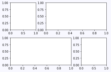
通过数组的方式我们可以更加轻松的控制大小。
三.一个有趣的实验
接下来我们通过一个实验来进行边缘概率密度的可视化,这个实验同时运用了以上介绍的所用东西,实验结果可以说是非常直观,程序的实现也不复杂。
步骤是先生成二维高斯分布,然后分别绘制每一维的边缘概率密度:
import numpy as np
import matplotlib.pyplot as plt
# Create some normally distributed data
mean = [0, 0]
cov = [[1, 1], [1, 2]]
x, y = np.random.multivariate_normal(mean, cov, 3000).T

# Set up the axes with gridspec
fig = plt.figure(figsize=(6, 6))
grid = plt.GridSpec(4, 4, hspace=0.2, wspace=0.2)
main_ax = fig.add_subplot(grid[:-1, 1:])
y_hist = fig.add_subplot(grid[:-1, 0], xticklabels=[], sharey=main_ax)
x_hist = fig.add_subplot(grid[-1, 1:], yticklabels=[], sharex=main_ax)

# scatter points on the main axes
main_ax.plot(x, y, "ok", markersize=3, alpha=0.2)

# histogram on the attached axes
x_hist.hist(x, 40, histtype="stepfilled",
            orientation="vertical", color="gray")
x_hist.invert_yaxis()

y_hist.hist(y, 40, histtype="stepfilled",
            orientation="horizontal", color="gray")
y_hist.invert_xaxis()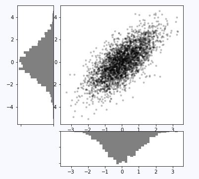
声明:该文观点仅代表作者本人,牛骨文系教育信息发布平台,牛骨文仅提供信息存储空间服务。