

иљђиљљиѓЈж†ЗжШОеЗЇе§ДпЉЪ
http://blog.csdn.net/developer_jiangqq/article/details/50589570
жЬђжЦЗеЗЇиЗ™:гАРж±ЯжЄЕжЄЕзЪДеНЪеЃҐгАС
(дЄА)еЙНи®А
¬† ¬† ¬†¬†¬†гАРе•љжґИжБѓгАСдЄ™дЇЇзљСзЂЩеЈ≤зїПдЄКзЇњињРи°М,еРОйЭҐеНЪеЃҐдї•еПКжКАжЬѓеє≤иіІз≠Йз≤Њељ©жЦЗзЂ†дЉЪеРМж≠•жЫіжЦ∞пЉМиѓЈе§ІеЃґеЕ≥ж≥®жФґиЧП:http://www.lcode.org¬†¬†
¬† ¬† ¬† дїК姩жИСдїђдЄАиµЈжЭ•зЬЛдЄАдЄЛжЦЗжЬђиЊУеЕ•ж°ЖTextInputзїДдїґзЪДзЫЄеЕ≥дљњзФ®иЃ≤иІ£дї•еПКж®°дїњеЃЮзО∞дЄАдЄЛQQзЩїељХзХМйЭҐзЪДжХИжЮЬгАВеЕЈдљУзОѓеҐГжР≠еїЇдї•еПКзЫЄеЕ≥йЕНзљЃзЪДиѓЈжЯ•зЬЛдєЛеЙНзЪДзЫЄеЕ≥жЦЗзЂ†гАВ
¬†¬†¬†¬†¬†¬†¬†еИЪеИЫеїЇзЪДReact NativeжКАжЬѓдЇ§жµБ1зЊ§(282693535),React NativeдЇ§жµБ2зЊ§:(496601483)пЉМиѓЈдЄНи¶БйЗНе§НеК†зЊ§пЉБ搥ињОеРДдљНе§ІзЙЫ,ReactNativeжКАжЬѓзИ±е•љиАЕеК†еЕ•дЇ§жµБ!еРМжЧґеНЪ健壶䌲搥ињОеЊЃдњ°жЙЂжППеЕ≥ж≥®иЃҐйШЕеПЈ,зІїеК®жКАжЬѓеє≤иіІ,з≤Њељ©жЦЗзЂ†жКАжЬѓжО®йАБ!
¬†¬†¬†¬†¬†¬†¬†¬† TextInputзїДдїґеЕБиЃЄзФ®жИЈеЬ®еЇФзФ®дЄ≠йАЪињЗйФЃзЫШињЫи°МиЊУеЕ•жЦЗжЬђдњ°жБѓгАВеєґдЄФиѓ•зїДдїґињШжПРдЊЫдЇЖе§ЪзІНйЕНзљЃе±ЮжАІдЊЛе¶В:иЗ™еК®жЛЉеЖЩдњЃе§Н,иЗ™еК®е§Іе∞ПеЖЩеИЗжНҐ,еН†дљНйїШиЃ§е≠Чзђ¶иЃЊзљЃдї•еПКе§ЪзІНдЄНеРМз±їеЮЛзЪДйФЃзЫШеИЗжНҐдЊЛе¶В:жИСдїђеПѓдї•еЉєеЗЇжХ∞е≠ЧйФЃзЫШгАВ
(дЇМ)еЃЮдЊЛ
¬†¬†¬†¬†¬†¬†¬†¬†¬† TextInputзїДдїґеТМеЙНйЭҐиЃ≤зЪДImageжИЦиАЕTextзїДдїґеЈЃдЄНе§ЪпЉМзФ®иµЈжЭ•йГљйЭЮеЄЄзЃАеНХгАВжИСдїђзЫіжО•еЬ®еЇФзФ®дЄ≠жЈїеК†дЄАдЄ™TextInputзїДдїґпЉМзДґеРОзїЩиѓ•зїДдїґжЈїеК†зЫЄеЕ≥е±ЮжАІ(дЊЛ:иЊєж°ЖйҐЬиЙ≤,з≤ЧзїЖ,иГМжЩѓ,йїШиЃ§еАЉ)дї•еПКзЫСеРђжЦєж≥Х(дЊЛе¶В:иЊУеЕ•дњ°жБѓ,зД¶зВєеПШеМЦз≠ЙдЇЛдїґ)гАВжИСдїђй¶ЦеЕИзЬЛдЄАдЄЛеЃШжЦєжПРдЊЫзЪДдЄАдЄ™зЃАеНХдЊЛе≠Р:¬†¬†¬†¬†¬†¬†¬†¬†
<TextInput
    style={{height: 40, borderColor: "gray",borderWidth: 1}}
    onChangeText={(text) =>this.setState({text})}
    value={this.state.text}
  />
иѓ•зЫіжО•еЃЪдєЙдЇЖTextInputзїДдїґпЉМеРМжЧґиЃЊзљЃзїДдїґзЪДй£Ож†ЉйЂШеЇ¶,еПШеЃљз≤ЧзїЖдї•еПКиЊєж°ЖйҐЬиЙ≤гАВеєґдЄФжИСдїђињЩиЊєзЫСеРђдЇЖTextInputзЪДonChangeTextзЪДдЇЛдїґжЭ•ињЫи°МиОЈеПЦзФ®жИЈзЪДиЊУеЕ•дњ°жБѓгАВйЩ§дЇЖиѓ•зЫСеРђдЇЛдїґжЦєж≥Хдї•е§ЦињШжЬЙonSubmitEditing(жПРдЇ§зЉЦиЊС)дї•еПКonFoucs(иЊУеЕ•ж°ЖиОЈеПЦзД¶зВєзЪДжЧґеАЩи∞ГзФ®)з≠ЙзЫЄеЕ≥зЪДзЫСеРђжЦєж≥ХгАВ
¬†¬†¬†¬†¬†¬†¬†¬†¬†¬†¬†дЄЛйЭҐеЬ®жЉФз§ЇеП¶е§ЦдЄАдЄ™TextInputеЃЮдЊЛпЉМиѓ•еИЫеїЇдЇЖдЄЙдЄ™TextInputпЉМеРМжЧґжѓПдЄ™TextInputйГљжЈїеК†дЇЖйїШиЃ§дњ°жБѓ(hit)пЉМзђђдЄАдЄ™TextInputзїДдїґиЃЊзљЃйЂШеЇ¶40,иЊєж°Жз≤ЧзїЖеТМиЊєж°ЖзЪДйҐЬиЙ≤пЉМеИЗеПѓдї•иЊУеЕ•е§Ъи°Мдњ°жБѓгАВзђђдЇМдЄ™TextInputиЃЊзљЃеЈ¶еП≥йҐЭиЊєиЈЭдї•еПКиЗ™еК®иОЈеПЦеИ∞зД¶зВєгАВзђђдЄЙдЄ™TextInputиЃЊзљЃдЄНеПѓзЉЦиЊСзКґжАБгАВеЕЈдљУдї£з†Бе¶ВдЄЛ:
<View style={styles.container}>
<Text style={styles.welcome}>
Welcome to React Native!
</Text>
<TextInputstyle={{height:40,borderColor:"red",borderWidth:1}}
multiline={true}
defaultValue="йїШиЃ§дњ°жБѓ1"
/>
<TextInput
style={{marginLeft:10,marginRight:10}}
autoFocus={true}
defaultValue="йїШиЃ§дњ°жБѓ2"/>
<TextInput
editable={false}
defaultValue="йїШиЃ§дњ°жБѓ3"/>
</View>
еЕЈдљУињРи°МжХИжЮЬе¶ВдЄЛ:

(дЄЙ)е±ЮжАІжЦєж≥Х(ињЩиЊєиЃ≤иІ£еє≥еП∞еЕђзФ®дї•еПКAndroidзФЯжХИзЪДе±ЮжАІжЦєж≥Х)
¬†¬†¬†¬†¬†¬†¬†¬†¬† 3.1.View¬†жФѓжМБViewзЪДзЫЄеЕ≥е±ЮжАІ
¬†¬†¬†¬†¬†¬†¬†¬†¬† 3.2.autoCapitalize¬†¬†жОІеИґTextInputиЊУеЕ•зЪДе≠Чзђ¶ињЫи°МеИЗжНҐжИРе§ІеЖЩ(еПѓйАЙжЛ©еПВжХ∞:"none", "sentences", "words","characters")
- none:дЄНиЗ™еК®еИЗжНҐдїїдљХе≠Чзђ¶жИРе§ІеЖЩ
- sentences:йїШиЃ§жѓПдЄ™еП•е≠РзЪДй¶Це≠ЧжѓНеПШжИРе§ІеЖЩ
- words:жѓПдЄ™еНХиѓНзЪДй¶Це≠ЧжѓНеПШжИРе§ІеЖЩ
- characters:жѓПдЄ™е≠ЧжѓНеЕ®йГ®еПШжИРе§ІеЖЩ
3.3.autoCorrect¬†¬†bool¬†¬†иЃЊзљЃжЛЉеЖЩиЗ™еК®дњЃж≠£еКЯиГљ¬†йїШиЃ§дЄЇеЉАеРѓ(true)
3.4.autoFocusbool¬†¬†иЃЊзљЃжШѓеР¶йїШиЃ§иОЈеПЦеИ∞зД¶зВєйїШиЃ§дЄЇеЕ≥йЧ≠(false)гАВиѓ•йЬАи¶БcomponentDidMountжЦєж≥Х襀и∞ГзФ®дєЛеРОжЙНдЉЪиОЈеПЦзД¶зВєеУ¶(componentDidMountжШѓReactзїД俴襀жЄ≤жЯУдєЛеРОReactдЄїеК®еЫЮи∞ГзЪДжЦєж≥Х)
3.5.defaultValue¬†¬†string¬†зїЩжЦЗжЬђиЊУеЕ•иЃЊзљЃдЄАдЄ™йїШиЃ§еИЭеІЛеАЉгАВ
3.6.editablebool¬†¬†иЃЊзљЃжЦЗжЬђж°ЖжШѓеР¶еПѓдї•зЉЦиЊС¬†йїШиЃ§еАЉдЄЇtrue,еПѓдї•ињЫи°МзЉЦиЊС
3.7.keyboardType¬†¬†йФЃзЫШз±їеЮЛ(еПѓйАЙеПВжХ∞:"default", "email-address","numeric", "phone-pad", "ascii-capable", "numbers-and-punctuation","url", "number-pad", "name-phone-pad", "decimal-pad", "twitter", "web-search")¬†иѓ•зФ®жЭ•йАЙжЛ©йїШиЃ§еЉєеЗЇйФЃзЫШзЪДз±їеЮЛдЊЛе¶ВжИСдїђзФЪиЗ≥numericе∞±жШѓеЉєеЗЇжХ∞е≠ЧйФЃзЫШгАВйЙідЇОеє≥еП∞зЪДеОЯеЫ†е¶ВдЄЛзЪДеАЉжШѓжЙАжЬЙеє≥еП∞йГљеПѓдї•ињЫи°МйАЪзФ®зЪД
- default
- numeric¬†¬†¬†¬†¬†¬†¬†¬†¬†¬†¬†¬†жХ∞е≠ЧйФЃзЫШ
- email-address¬†¬†йВЃзЃ±еЬ∞еЭА
3.8.maxLength¬† number¬†¬†еПѓдї•йЩРеИґжЦЗжЬђиЊУеЕ•ж°ЖжЬАе§ІзЪДиЊУеЕ•е≠Чзђ¶йХњеЇ¶
3.9.multiline bool¬†¬†иЃЊзљЃеПѓдї•иЊУеЕ•е§Ъи°МжЦЗе≠ЧпЉМйїШиЃ§дЄЇfalse(и°®з§ЇжЧ†иЃЇжЦЗжЬђиЊУеЕ•е§Ъе∞СпЉМйГљжШѓеНХи°МжШЊз§Ї)
3.10.onBlur¬†¬†function¬†зЫСеРђжЦєж≥ХпЉМжЦЗжЬђж°Ж姱еОїзД¶зВєеЫЮи∞ГжЦєж≥Х
3.11.onChange function¬†зЫСеРђжЦєж≥Х,жЦЗжЬђж°ЖеЖЕеЃєеПСзФЯжФєеПШеЫЮи∞ГжЦєж≥Х
3.12.onChangeText¬† functionзЫСеРђжЦєж≥ХпЉМжЦЗжЬђж°ЖеЖЕеЃєеПСзФЯжФєеПШеЫЮи∞ГжЦєж≥ХпЉМиѓ•жЦєж≥ХдЉЪињЫи°МдЉ†йАТжЦЗжЬђеЖЕеЃє
3.13.onEndEditing¬†¬†functionзЫСеРђжЦєж≥ХпЉМељУжЦЗжЬђзїУжЭЯжЦЗжЬђиЊУеЕ•еЫЮи∞ГжЦєж≥Х
3.14.onFocus¬† function¬†зЫСеРђжЦєж≥Х¬†¬†жЦЗжЬђж°ЖиОЈеПЦеИ∞зД¶зВєеЫЮи∞ГжЦєж≥Х
3.15.onLayout¬† functionзЫСеРђжЦєж≥Х¬†¬†зїДдїЈеЄГе±АеПСзФЯеПШеМЦзЪДжЧґеАЩи∞ГзФ®пЉМи∞ГзФ®жЦєж≥ХеПВжХ∞дЄЇ¬†{x,y,width,height}
3.16.onSubmitEditing functionзЫСеРђжЦєж≥ХпЉМељУзЉЦиЊСжПРдЇ§зЪДжЧґеАЩеЫЮи∞ГжЦєж≥ХгАВдЄНињЗе¶ВжЮЬmultiline={true}зЪДжЧґеАЩпЉМиѓ•е±ЮжАІе∞±дЄНзФЯжХИ
3.17.placeholer string¬†ељУжЦЗжЬђиЊУеЕ•ж°ЖињШж≤°жЬЙдїїдљХиЊУеЕ•зЪДжЧґеАЩпЉМйїШиЃ§жШЊз§Їдњ°жБѓпЉМељУжЬЙиЊУеЕ•зЪДжЧґеАЩиѓ•еАЉдЉЪ襀жЄЕйЩ§
3.18.placeholerTextColor¬†¬†string¬†иЃЊзљЃйїШиЃ§дњ°жБѓйҐЬиЙ≤(placeholer)
3.19.secureTextEntry¬† bool¬†иЃЊзљЃжШѓеР¶дЄЇеѓЖз†БеЃЙеЕ®иЊУеЕ•ж°Ж¬†пЉМйїШиЃ§дЄЇfalse
3.20.style¬†й£Ож†Ље±ЮжАІ¬†¬†еПѓдї•еПВиАГTextзїДдїґй£Ож†Љ
3.21.value¬†¬†string¬†иЊУеЕ•ж°ЖдЄ≠зЪДеЖЕеЃєеАЉ
дї•дЄКжШѓдЄАдЇЫAndroidпЉМiOSеє≥еП∞йАЪзФ®зЪДе±ЮжАІпЉМдЄЛйЭҐж†єжНЃеЃШзљСзЪДжЦЗж°£пЉМжИСињЩиЊєзїДи¶БиЃ≤иІ£дЄАдЄЛйАВзФ®дЇОAndroidеє≥еП∞зЪДе±ЮжАІжЦєж≥Х
¬†¬†¬†¬†¬†¬†¬†¬†¬† 3.22.numberOfLinesnumberиЃЊзљЃжЦЗжЬђиЊУеЕ•ж°Жи°МжХ∞пЉМиѓ•йЬАи¶Бй¶ЦеЕИиЃЊзљЃmultilineдЄЇtrue,иЃЊзљЃTextInputдЄЇе§Ъи°МжЦЗжЬђгАВ
¬†¬†¬†¬†¬†¬†¬†¬†¬† 3.23.textAlign¬†иЃЊзљЃжЦЗжЬђж®™еРСеЄГе±АжЦєеЉП¬†еПѓйАЙеПВжХ∞("start", "center", "end")
¬†¬†¬†¬†¬†¬†¬†¬†¬† 3.24.textAlignVertical¬†иЃЊзљЃжЦЗжЬђеЮВзЫіжЦєеРСеЄГе±АжЦєеЉП¬†еПѓйАЙеПВжХ∞("top", "center", "bottom")
¬†¬†¬†¬†¬†¬†¬†¬†¬† 3.25.underlineColorAndroid¬†¬†иЃЊзљЃжЦЗжЬђиЊУеЕ•ж°ЖдЄЛеИТзЇњзЪДйҐЬиЙ≤
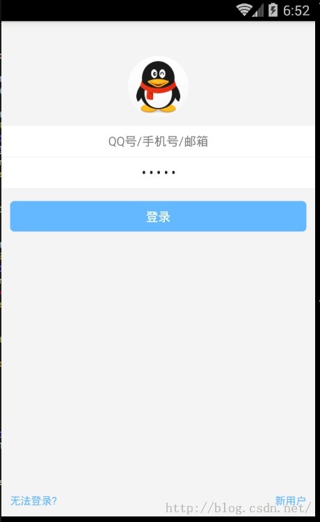
(еЫЫ)TextInputеЃЮжИШ-дїњзЕІQQзЩїељХзХМйЭҐ
¬†¬†¬†¬†¬†¬†¬†¬†дЄЛйЭҐжИСдїђжЭ•дїњзЕІQQзЩїељХзХМйЭҐзЪДжХИжЮЬпЉМињЫи°МеЄГе±АдЄАдЄЛпЉМеЕЈдљУеЃЮзО∞дї£з†Бе¶ВдЄЛ:
/**
* Sample React Native App
* https://github.com/facebook/react-native
*/
"use strict";
import React, {
AppRegistry,
Component,
StyleSheet,
Text,
Image,
View,
TextInput,
} from"react-native";
class TestInputextends Component {
render() {
return (
<Viewstyle={{backgroundColor:"#f4f4f4",flex:1}}>
<Image
style={styles.style_image}
source={require("./img/app_icon.png")}/>
<TextInput
style={styles.style_user_input}
placeholder="QQеПЈ/жЙЛжЬЇеПЈ/йВЃзЃ±"
numberOfLines={1}
autoFocus={true}
underlineColorAndroid={"transparent"}
textAlign="center"
/>
<View
style={{height:1,backgroundColor:"#f4f4f4"}}
/>
<TextInput
style={styles.style_pwd_input}
placeholder="еѓЖз†Б"
numberOfLines={1}
underlineColorAndroid={"transparent"}
secureTextEntry={true}
textAlign="center"
/>
<View
style={styles.style_view_commit}
>
<Text style={{color:"#fff"}}>
зЩїељХ
</Text>
</View>
<Viewstyle={{flex:1,flexDirection:"row",alignItems: "flex-end",bottom:10}}>
<Textstyle={styles.style_view_unlogin}>
жЧ†ж≥ХзЩїељХ?
</Text>
<Textstyle={styles.style_view_register}>
жЦ∞зФ®жИЈ
</Text>
</View>
</View>
);
}
}
const styles =StyleSheet.create({
style_image:{
borderRadius:35,
height:70,
width:70,
marginTop:40,
alignSelf:"center",
},
style_user_input:{
backgroundColor:"#fff",
marginTop:10,
height:35,
},
style_pwd_input:{
backgroundColor:"#fff",
height:35,
},
style_view_commit:{
marginTop:15,
marginLeft:10,
marginRight:10,
backgroundColor:"#63B8FF",
height:35,
borderRadius:5,
justifyContent: "center",
alignItems: "center",
},
style_view_unlogin:{
fontSize:12,
color:"#63B8FF",
marginLeft:10,
},
style_view_register:{
fontSize:12,
color:"#63B8FF",
marginRight:10,
alignItems:"flex-end",
flex:1,
flexDirection:"row",
textAlign:"right",
}
});
AppRegistry.registerComponent("TestInput",() => TestInput);
ињРи°МжХИжЮЬе¶ВдЄЛ:
(дЇФ)жЬАеРОжАїзїУ
¬†¬†¬†¬†¬†¬†¬†¬†¬†¬†дїК姩жИСдїђдЄїи¶БзїЩе§ІеЃґдїЛзїНTextInputзїДдїґпЉМдї•еПКйАЪињЗдЄАдЄ™QQзЩїељХзХМйЭҐеЕЈдљУеЃЮдЊЛжККдєЛеЙНзЪДView,Text,ImageзїДдїґзЪДеЯЇжЬђдљњзФ®дЄ≤иБФдЇЖдЄАдЄЛгАВе§ІеЃґжЬЙйЧЃйҐШеПѓдї•еК†дЄАдЄЛзЊ§React NativeжКАжЬѓдЇ§жµБзЊ§(282693535)жИЦиАЕеЇХдЄЛињЫи°МеЫЮе§НдЄАдЄЛгАВ
¬† ¬† ¬† ¬† ¬†е∞КйЗНеОЯеИЫпЉМиљђиљљиѓЈж≥®жШОпЉЪFrom SkyдЄґжЄЕпЉИhttp://blog.csdn.net/developer_jiangqqпЉЙ дЊµжЭГењЕз©ґпЉБ
¬† ¬† ¬† ¬†еЕ≥ж≥®жИСзЪДиЃҐйШЕеПЈ(codedev123),жѓП姩еИЖдЇЂзІїеК®еЉАеПСжКАжЬѓ(Android/IOS),й°єзЫЃзЃ°зРЖдї•еПКеНЪеЃҐжЦЗзЂ†!(搥ињОеЕ≥ж≥®пЉМзђђдЄАжЧґйЧіжО®йАБз≤Њељ©жЦЗзЂ†)

¬† ¬† ¬†еЕ≥ж≥®жИСзЪДеЊЃеНЪпЉМеПѓдї•иОЈеЊЧжЫіе§Ъз≤Њељ©еЖЕеЃє