зФ®CSS3еЃЮзО∞еЫЊеГПй£Ож†Љ
¬† ¬† ¬† иѓСиЗ™пЉЪhttp://webdesignerwall.com/tutorials/css3-image-styles
¬† ¬† ¬†¬†иљђиљљиѓЈж†ЗжШОеЗЇе§ДпЉЪиТЛеЃЗжНЈзЪДеНЪеЃҐ(http://blog.csdn.net/hfahe)¬†
      - - - - - -
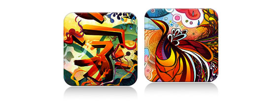
ељУеЬ®еЫЊеГПеЕГзі†дЄКзЫіжО•дљњзФ®CSS3еЖЕйШіељ±жИЦиАЕеЬЖиІТиЊєж°ЖжЧґпЉМжµПиІИеЩ®еѓєдЇОCSSж†ЈеЉПзЪДжЄ≤жЯУеєґдЄНеЃМзЊОгАВдљЖжШѓпЉМе¶ВжЮЬеЫЊеГПдљЬдЄЇиГМжЩѓеЫЊеГПдљњзФ®жЧґпЉМдљ†еПѓдї•дЄЇеЃГжЈїеК†дїїдљХж†ЈеЉПпЉМиАМдЄФеПѓдї•еЃЮзО∞еЃМзЊОзЪДжЄ≤жЯУгАВDarcy ClarkeеТМжИСдЄАиµЈзЉЦеЖЩдЇЖдЄАдЄ™е¶ВдљХдљњзФ®jQueryжЭ•еК®жАБеИЫеїЇеЃМзЊОеЬЖиІТиЊєж°ЖзЪДењЂйАЯжХЩз®ЛгАВдїК姩жИСи¶БйЗНеРѓињЩдЄ™иѓЭйҐШпЉМеРСдљ†е±Хз§ЇдљњзФ®CSSзЪДиГМжЩѓеЫЊеГПжКАеЈІжИСдїђињШеПѓдї•еБЪе§Ъе∞СдЇЛжГЕгАВжИСе∞ЖеРСдљ†е±Хз§Їе¶ВдљХдљњзФ®зЫТйШіељ±гАБеЬЖиІТиЊєж°ЖеТМиљђжНҐжЭ•еИЫеїЇдЄНеРМзЪДеЫЊеГПж†ЈеЉПгАВ

йЧЃйҐШпЉИиІБжЉФз§ЇпЉЙ
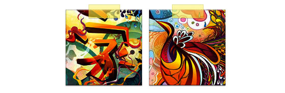
жЯ•зЬЛжЉФз§ЇпЉМдљ†дЉЪеПСзО∞зђђдЄАжОТзЪДеЫЊеГПеЇФзФ®дЇЖеЬЖиІТиЊєж°ЖеТМеЖЕйШіељ±гАВFirefoxеЬ®еЫЊзЙЗеЕГзі†дЄКжФѓжМБеЬЖиІТиЊєж°ЖпЉМдљЖжШѓдЄНжФѓжМБеЖЕйШіељ±зЪДжЄ≤жЯУгАВChromeеТМSafariеЃМеЕ®дЄНжФѓжМБеЬЖиІТиЊєж°ЖеТМеЖЕйШіељ±зЪДжЄ≤жЯУгАВ
иІ£еЖ≥жЦєж°И
и¶БдљњзФ®еЬЖиІТиЊєж°ЖеТМеЖЕйШіељ±пЉМиІ£еЖ≥жЦєж°ИжШѓжККжЙАйЬАзЪДеЫЊеГПиЃЊзљЃдЄЇиГМжЩѓеЫЊеГПгАВ
еК®жАБзЪДжЦєеЉП
и¶БйЗЗзФ®еК®жАБзЪДжЦєеЉПеЃЮзО∞пЉМдљ†еПѓдї•дљњзФ®jQueryжЭ•е∞ЖжѓПдЄАдЄ™еЫЊеГПеЕГзі†еК®жАБзЪДеМЕи£ЕдЄЇиГМжЩѓеЫЊеГПгАВе¶ВдЄЛзЪДjQueryдї£з†БдљњзФ®spanж†Зз≠ЊжЭ•еМЕи£ЕжЙАжЬЙзЪДеЫЊеГПпЉМеєґдЄФе∞ЖеЫЊеГПеЇФзФ®дЄЇиГМжЩѓеЫЊеГПпЉИjQueryдї£з†БжЭ•иЗ™Darcy ClarkeпЉЙгАВ
<script type="text/javascript" src="http://ajax.googleapis.com/ajax/libs/jquery/1.5/jquery.min.js"></script>
<script type="text/javascript">
$(document).ready(function(){

  $("img").load(function() {
    $(this).wrap(function(){
      return "<span class="image-wrap " + $(this).attr("class") + "" style="position:relative; display:inline-block; background:url(" + $(this).attr("src") + ") no-repeat center center; width: " + $(this).width() + "px; height: " + $(this).height() + "px;" />";
    });
    $(this).css("opacity","0");
  });

});
</script>
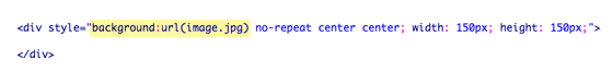
иЊУеЗЇ
дЄКйЭҐзЪДдї£з†Бе∞ЖиЊУеЕ•е¶ВдЄЛзЪДHTMLдї£з†БпЉЪ
<span class="image-wrap " style="position:relative; display:inline-block; background:url(image.jpg) no-repeat center center; width: 150px; height: 150px;">
	<img src="image.jpg" style="opacity: 0;">
</span>
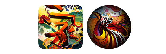
еЬЖ嚥еЫЊеГПпЉИиІБжЉФз§ЇпЉЙ
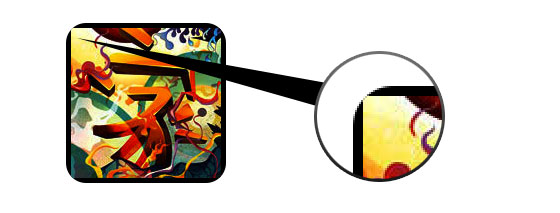
зО∞еЬ®еЫЊзЙЗеЈ≤зїП襀еЇФзФ®дЄЇиГМжЩѓеЫЊеГПпЉМдљ†еЗ†дєОеПѓдї•дЄЇеЃГжЈїеК†дїїдљХж†ЈеЉПгАВе¶ВдЄЛжШѓдЄАдЄ™зФ®еЬЖиІТиЊєж°ЖеИЫеїЇзЪДзЃАеНХеЬЖ嚥еЫЊеГПгАВе¶ВжЮЬдљ†ињШдЄНзЖЯжВЙCSS3пЉМиѓЈйШЕиѓїжИСеѓєCSS3зЪДеЯЇз°АжХЩз®ЛгАВ
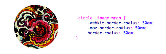
CSS
.circle .image-wrap {
	-webkit-border-radius: 50em;
	-moz-border-radius: 50em;
	border-radius: 50em;
}
еН°зЙЗй£Ож†ЉпЉИиІБжЉФз§ЇпЉЙ
е¶ВдЄЛжШѓдЄАдЄ™зФ®е§ЪеЖЕйШіељ±еАЉеИЫеїЇзЪДеН°зЙЗеЫЊеГПж†ЈеЉПгАВ
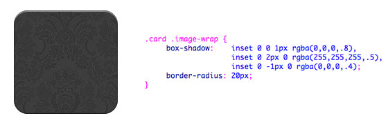
CSS
.card .image-wrap {
	-webkit-box-shadow: inset 0 0 1px rgba(0,0,0,.8), inset 0 2px 0 rgba(255,255,255,.5), inset 0 -1px 0 rgba(0,0,0,.4);
	-moz-box-shadow: inset 0 0 1px rgba(0,0,0,.8), inset 0 2px 0 rgba(255,255,255,.5), inset 0 -1px 0 rgba(0,0,0,.4);
	box-shadow: inset 0 0 1px rgba(0,0,0,.8), inset 0 2px 0 rgba(255,255,255,.5), inset 0 -1px 0 rgba(0,0,0,.4);

	-webkit-border-radius: 20px;
	-moz-border-radius: 20px;
	border-radius: 20px;
}
жµЃйЫХй£Ож†ЉпЉИиІБжЉФз§ЇпЉЙ
еБЪдЄАдЇЫи∞ГжХіпЉМжИСеПѓдї•е∞ЖеН°зЙЗж†ЈеЉПеПШжИРжµЃйЫХж†ЈеЉПгАВ
CSS
.embossed .image-wrap {
	-webkit-box-shadow: inset 0 0 2px rgba(0,0,0,.8), inset 0 2px 0 rgba(255,255,255,.5), inset 0 -7px 0 rgba(0,0,0,.6), inset 0 -9px 0 rgba(255,255,255,.3);
	-moz-box-shadow: inset 0 0 2px rgba(0,0,0,.8), inset 0 2px 0 rgba(255,255,255,.5), inset 0 -7px 0 rgba(0,0,0,.6), inset 0 -9px 0 rgba(255,255,255,.3);
	box-shadow: inset 0 0 2px rgba(0,0,0,.8), inset 0 2px 0 rgba(255,255,255,.5), inset 0 -7px 0 rgba(0,0,0,.6), inset 0 -9px 0 rgba(255,255,255,.3);

	-webkit-border-radius: 20px;
	-moz-border-radius: 20px;
	border-radius: 20px;
}
иљѓжµЃйЫХй£Ож†ЉпЉИиІБжЉФз§ЇпЉЙ
ињЩеЗ†дєОеТМжµЃйЫХж†ЈеЉПзЫЄеРМпЉМжИСеП™еК†дЇЖ1дЄ™еГПзі†зЪДж®°з≥КгАВ
CSS
.embossed .image-wrap {
	-webkit-box-shadow: inset 0 0 2px rgba(0,0,0,.8), inset 0 2px 0 rgba(255,255,255,.5), inset 0 -7px 0 rgba(0,0,0,.6), inset 0 -9px 0 rgba(255,255,255,.3);
	-moz-box-shadow: inset 0 0 2px rgba(0,0,0,.8), inset 0 2px 0 rgba(255,255,255,.5), inset 0 -7px 0 rgba(0,0,0,.6), inset 0 -9px 0 rgba(255,255,255,.3);
	box-shadow: inset 0 0 2px rgba(0,0,0,.8), inset 0 2px 0 rgba(255,255,255,.5), inset 0 -7px 0 rgba(0,0,0,.6), inset 0 -9px 0 rgba(255,255,255,.3);

	-webkit-border-radius: 20px;
	-moz-border-radius: 20px;
	border-radius: 20px;
}
еЙ™иіізФїй£Ож†ЉпЉИиІБжЉФз§ЇпЉЙ
еЖНжђ°йАЪињЗеѓєеЖЕйШіељ±зЪДи∞ГжХіпЉМжИСеПѓдї•иЃ©еЃГзЬЛиµЈжЭ•еГПдЄАдЄ™еЙ™иіізФїжХИжЮЬгАВ

CSS
.cut-out .image-wrap {
	-webkit-box-shadow: 0 1px 0 rgba(255,255,255,.2), inset 0 4px 5px rgba(0,0,0,.6), inset 0 1px 0 rgba(0,0,0,.6);
	-moz-box-shadow: 0 1px 0 rgba(255,255,255,.2), inset 0 4px 5px rgba(0,0,0,.6), inset 0 1px 0 rgba(0,0,0,.6);
	box-shadow: 0 1px 0 rgba(255,255,255,.2), inset 0 4px 5px rgba(0,0,0,.6), inset 0 1px 0 rgba(0,0,0,.6);

	-webkit-border-radius: 20px;
	-moz-border-radius: 20px;
	border-radius: 20px;
}
еПШ嚥еТМеПСеЕЙпЉИиІБжЉФз§ЇпЉЙ
еЬ®ињЩдЄ™дЊЛе≠Рж±ЗжАїпЉМжИСдЄЇеЫЊеГПзЪДеМЕи£ЕеЕГзі†жЈїеК†дЇЖtransitionгАВељУйЉ†ж†ЗжїСињЗпЉМеЃГдЉЪдїОеЬЖиІТиЊєж°ЖеПШдЄЇеЬЖ嚥庴棿еК†еПСеЕЙзЪДжХИжЮЬгАВеПСеЕЙжХИжЮЬйЗЗзФ®е§ЪзЫТйШіељ±еАЉеЃЮзО∞гАВ

CSS
.morphing-glowing .image-wrap {
	-webkit-transition: 1s;
	-moz-transition: 1s;
	transition: 1s;

	-webkit-border-radius: 20px;
	-moz-border-radius: 20px;
	border-radius: 20px;
}

.morphing-glowing .image-wrap:hover {
	-webkit-box-shadow: 0 0 20px rgba(255,255,255,.6), inset 0 0 20px rgba(255,255,255,1);
	-moz-box-shadow: 0 0 20px rgba(255,255,255,.6), inset 0 0 20px rgba(255,255,255,1);
	box-shadow: 0 0 20px rgba(255,255,255,.6), inset 0 0 20px rgba(255,255,255,1);

	-webkit-border-radius: 60em;
	-moz-border-radius: 60em;
	border-radius: 60em;
}
еЕЙж≥љи¶ЖзЫЦпЉИиІБжЉФз§ЇпЉЙ
жИСдїђйЗЗзФ®:afterдЉ™з±їеЕГзі†еЃЮзО∞е¶ВдЄЛзЪДеЕЙж≥љжЄРеПШи¶ЖзЫЦжХИжЮЬгАВ

CSS
.glossy .image-wrap {
	-webkit-box-shadow: inset 0 -1px 0 rgba(0,0,0,.5);
	-moz-box-shadow: inset 0 -1px 0 rgba(0,0,0,.5);
	box-shadow: inset 0 -1px 0 rgba(0,0,0,.5);

	-webkit-border-radius: 20px;
	-moz-border-radius: 20px;
	border-radius: 20px;
}

.glossy .image-wrap:after {
	position: absolute;
	content: " ";
	width: 100%;
	height: 50%;
	top: 0;
	left: 0;

	-webkit-border-radius: 20px;
	-moz-border-radius: 20px;
	border-radius: 20px;

	background: -moz-linear-gradient(top, rgba(255,255,255,0.7) 0%, rgba(255,255,255,.1) 100%);
	background: -webkit-gradient(linear, left top, left bottom, color-stop(0%,rgba(255,255,255,0.7)), color-stop(100%,rgba(255,255,255,.1)));
	background: linear-gradient(top, rgba(255,255,255,0.7) 0%,rgba(255,255,255,.1) 100%);
}
жКХељ±пЉИиІБжЉФз§ЇпЉЙ
еЬ®ињЩдЄ™дЊЛе≠РдЄ≠пЉМжИСе∞Жи¶ЖзЫЦжЄРеПШжНҐеИ∞еЇХйГ®жЭ•еИЫеїЇжКХељ±жХИжЮЬгАВ
CSS
.reflection .image-wrap:after {
	position: absolute;
	content: " ";
	width: 100%;
	height: 30px;
	bottom: -31px;
	left: 0;

	-webkit-border-top-left-radius: 20px;
	-webkit-border-top-right-radius: 20px;
	-moz-border-radius-topleft: 20px;
	-moz-border-radius-topright: 20px;
	border-top-left-radius: 20px;
	border-top-right-radius: 20px;

	background: -moz-linear-gradient(top, rgba(0,0,0,.3) 0%, rgba(255,255,255,0) 100%);
	background: -webkit-gradient(linear, left top, left bottom, color-stop(0%,rgba(0,0,0,.3)), color-stop(100%,rgba(255,255,255,0)));
	background: linear-gradient(top, rgba(0,0,0,.3) 0%,rgba(255,255,255,0) 100%);
}

.reflection .image-wrap:hover {
	position: relative;
	top: -8px;
}
еЕЙж≥љеТМжКХељ±пЉИиІБжЉФз§ЇпЉЙ
еЬ®ињЩдЄ™з§ЇдЊЛдЄ≠пЉМжИСе∞Ж:beforeеТМ:afterеРИеєґпЉМзФ®жЭ•еИЫеїЇеЄ¶жКХељ±жХИжЮЬзЪДеЕЙж≥ље§іеГПгАВ

CSS
.glossy-reflection .image-wrap {
	-webkit-box-shadow: inset 0 -1px 0 rgba(0,0,0,.5), inset 0 1px 0 rgba(255,255,255,.6);
	-moz-box-shadow: inset 0 -1px 0 rgba(0,0,0,.5), inset 0 1px 0 rgba(255,255,255,.6);
	box-shadow: inset 0 -1px 0 rgba(0,0,0,.5), inset 0 1px 0 rgba(255,255,255,.6);

	-webkit-transition: 1s;
	-moz-transition: 1s;
	transition: 1s;

	-webkit-border-radius: 20px;
	-moz-border-radius: 20px;
	border-radius: 20px;
}

.glossy-reflection .image-wrap:before {
	position: absolute;
	content: " ";
	width: 100%;
	height: 50%;
	top: 0;
	left: 0;

	-webkit-border-radius: 20px;
	-moz-border-radius: 20px;
	border-radius: 20px;

	background: -moz-linear-gradient(top, rgba(255,255,255,0.7) 0%, rgba(255,255,255,.1) 100%);
	background: -webkit-gradient(linear, left top, left bottom, color-stop(0%,rgba(255,255,255,0.7)), color-stop(100%,rgba(255,255,255,.1)));
	background: linear-gradient(top, rgba(255,255,255,0.7) 0%,rgba(255,255,255,.1) 100%);
}

.glossy-reflection .image-wrap:after {
	position: absolute;
	content: " ";
	width: 100%;
	height: 30px;
	bottom: -31px;
	left: 0;

	-webkit-border-top-left-radius: 20px;
	-webkit-border-top-right-radius: 20px;
	-moz-border-radius-topleft: 20px;
	-moz-border-radius-topright: 20px;
	border-top-left-radius: 20px;
	border-top-right-radius: 20px;

	background: -moz-linear-gradient(top, rgba(230,230,230,.3) 0%, rgba(230,230,230,0) 100%);
	background: -webkit-gradient(linear, left top, left bottom, color-stop(0%,rgba(230,230,230,.3)), color-stop(100%,rgba(230,230,230,0)));
	background: linear-gradient(top, rgba(230,230,230,.3) 0%,rgba(230,230,230,0) 100%);
}
з£БеЄ¶й£Ож†ЉпЉИиІБжЉФз§ЇпЉЙ
ињЩйЗМдљњзФ®:afterжЭ•еЬ®еЫЊеГПзЪДдЄКйГ®еИЫеїЇз£БеЄ¶еЉПзЪДжЄРеПШгАВ
CSS
.tape .image-wrap {
	-webkit-box-shadow: inset 0 0 2px rgba(0,0,0,.7), inset 0 2px 0 rgba(255,255,255,.3), inset 0 -1px 0 rgba(0,0,0,.5), 0 1px 3px rgba(0,0,0,.4);
	-moz-box-shadow: inset 0 0 2px rgba(0,0,0,.7), inset 0 2px 0 rgba(255,255,255,.3), inset 0 -1px 0 rgba(0,0,0,.5), 0 1px 3px rgba(0,0,0,.4);
	box-shadow: inset 0 0 2px rgba(0,0,0,.7), inset 0 2px 0 rgba(255,255,255,.3), inset 0 -1px 0 rgba(0,0,0,.5), 0 1px 3px rgba(0,0,0,.4);
}

.tape .image-wrap:after {
	position: absolute;
	content: " ";
	width: 60px;
	height: 25px;
	top: -10px;
	left: 50%;
	margin-left: -30px;
	border: solid 1px rgba(137,130,48,.2);

	background: -moz-linear-gradient(top, rgba(254,243,127,.6) 0%, rgba(240,224,54,.6) 100%);
	background: -webkit-gradient(linear, left top, left bottom, color-stop(0%,rgba(254,243,127,.6)), color-stop(100%,rgba(240,224,54,.6)));
	background: linear-gradient(top, rgba(254,243,127,.6) 0%,rgba(240,224,54,.6) 100%);
	-webkit-box-shadow: inset 0 1px 0 rgba(255,255,255,.3), 0 1px 0 rgba(0,0,0,.2);
}
еПШ嚥еТМдЄКиЙ≤пЉИиІБжЉФз§ЇпЉЙ
еЬ®е¶ВдЄЛзЪДз§ЇдЊЛйЗМпЉМжИСдљњзФ®:afterеЕГзі†еЬ®йЉ†ж†ЗжїСињЗжЧґеИЫеїЇеЊДеРСжЄРеПШгАВ
CSS
.morphing-tinting .image-wrap {
	position: relative;

	-webkit-transition: 1s;
	-moz-transition: 1s;
	transition: 1s;

	-webkit-border-radius: 20px;
	-moz-border-radius: 20px;
	border-radius: 20px;
}

.morphing-tinting .image-wrap:hover {
	-webkit-border-radius: 30em;
	-moz-border-radius: 30em;
	border-radius: 30em;
}

.morphing-tinting .image-wrap:after {
	position: absolute;
	content: " ";
	width: 100%;
	height: 100%;
	top: 0;
	left: 0;

	-webkit-transition: 1s;
	-moz-transition: 1s;
	transition: 1s;

	-webkit-border-radius: 30em;
	-moz-border-radius: 30em;
	border-radius: 30em;
}
.morphing-tinting .image-wrap:hover:after  {
	background: -webkit-gradient(radial, 50% 50%, 40, 50% 50%, 80, from(rgba(0,0,0,0)), to(rgba(0,0,0,1)));
	background: -moz-radial-gradient(50% 50%, circle, rgba(0,0,0,0) 40px, rgba(0,0,0,1) 80px);
}
зЊљжѓЫиЊєеЬИпЉИиІБжЉФз§ЇпЉЙ
еЊДеРСжЄРеПШињШеПѓдї•дљЬдЄЇйБЃзљ©дљњзФ®жЭ•еИЫеїЇеЬЖ嚥зЪДзЊљжѓЫжХИжЮЬпЉМе¶ВдЄЛжЙАз§ЇгАВ

CSS
.feather .image-wrap {
	position: relative;

	-webkit-border-radius: 30em;
	-moz-border-radius: 30em;
	border-radius: 30em;
}

.feather .image-wrap:after  {
	position: absolute;
	content: " ";
	width: 100%;
	height: 100%;
	top: 0;
	left: 0;

	background: -webkit-gradient(radial, 50% 50%, 50, 50% 50%, 70, from(rgba(255,255,255,0)), to(rgba(255,255,255,1)));
	background: -moz-radial-gradient(50% 50%, circle, rgba(255,255,255,0) 50px, rgba(255,255,255,1) 70px);
}
жµПиІИеЩ®жФѓжМБ
ињЩдЄ™жКАеЈІеЗ†дєОеПѓдї•еЈ•дљЬеЬ®дїїдљХжФѓжМБеЬЖиІТиЊєж°ЖгАБзЫТйШіељ±гАБ:afterеТМ:beforeзЪДжµПиІИеЩ®дЄКпЉИдЊЛе¶ВChromeгАБFirefoxеТМSafariпЉЙгАВдЄНжФѓжМБзЪДжµПиІИеЩ®дЉЪжШЊз§Їж≤°жЬЙдїїдљХж†ЈеЉПзЪДеЫЊеГПгАВ
дљњзФ®дљ†зЪДеИЫйА†еКЫ
ж≠£е¶Вдљ†зЬЛеИ∞зЪДдЄАж†ЈпЉМдљњзФ®:beforeеТМ:afterдЉ™еЕГзі†дљ†еЗ†дєОеПѓдї•еИЫеїЇдїїдљХеЫЊеГПй£Ож†ЉгАВе¶ВжЮЬдљ†жЬЙжЫіеѓМжЬЙеИЫйА†еКЫзЪДеЫЊеГПй£Ож†ЉпЉМиѓЈеЬ®иѓДиЃЇдЄ≠еИЖдЇЂгАВ