з”ЁзәҜCSS3е®һзҺ°PathеҚҺдёҪеҠЁз”»
В В В 11жңҲ30ж—ҘзҶҹдәәзӨҫдәӨ移еҠЁеә”з”ЁPath 2.0
еҸ‘еёғеҗҺпјҢеӣ дёәе…¶зІҫзҫҺзҡ„з•Ңйқўе’ҢжјӮдә®зҡ„еҠЁз”»ж•ҲжһңеҸ—еҲ°и®ёеӨҡдәәзҡ„иөһиӘүпјҢеңЁPinterestд№ӢеҗҺпјҢеҸҲж¶Ңиө·дёҖиӮЎж–°зҡ„жЁЎд»ҝжөӘжҪ®гҖӮ
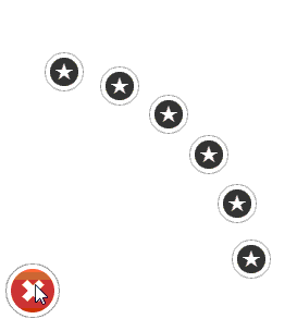
В В В Path 2.0зҡ„дёҖдёӘдә®зӮ№жҳҜе·ҰдёӢи§’зҡ„иҸңеҚ•еұ•ејҖеҠЁз”»ж•Ҳжһңпјҡ

В В В дёҖдёӘеҗҚдёәVictorзҡ„жі•еӣҪдәәдҪҝз”ЁзәҜCSS3еңЁHTMLдёҠе®һзҺ°дәҶеҗҢж ·зҡ„еҠЁз”»ж•ҲжһңпјҢжІЎжңүдҪҝз”Ёд»»дҪ•еӣҫзүҮе’ҢJavascriptпјҢе…·дҪ“йҮҮз”ЁSass+Compassи®Ўз®—еқҗж ҮпјҢжңҖеҗҺдёәжҜҸдёҖйЎ№з”ҹжҲҗдәҶKeyframeеҠЁз”»пјҢеҚҒеҲҶзҡ„жңүжғіиұЎеҠӣпјҢеҠЁз”»ж•ҲжһңеҰӮдёӢжүҖзӨәпјҢд№ҹеҸҜд»ҘеңЁhttp://dribbble.com/shots/339001-Path-menu-recreated-in-css3жҹҘзңӢгҖӮ
В В В д»Јз ҒйҮҢдҪҝз”ЁдәҶйқһеёёеӨҡCSS3зҡ„зү№жҖ§пјҢдҫӢеҰӮtransformгҖҒtranslate3dгҖҒrotateZгҖҒanimationгҖҒlinear-gradientгҖҒborder-radiusгҖҒtransitionгҖҒbox-shadowзӯүпјҢеҸҜд»ҘдҪңдёәеҫҲеҘҪзҡ„CSS3ж•ҷзЁӢе’ҢзӨәдҫӢпјҢдёҖдәӣзӣёе…ід»Јз ҒеҰӮдёӢжүҖзӨәпјҡ
#menu:checked ~ .items li:nth-child(3) {
  -webkit-animation-name: "appear-"3"";
  -webkit-animation-duration: 240ms;
  -webkit-animation-iteration-count: 1;
  -webkit-animation-fill-mode: forwards;
  -webkit-animation-delay: 60ms;
}

@-webkit-keyframes "appear-"3"" {
  /* line 48, ../sass/app.scss */
  0% {
    -webkit-transform: translate3d(0, 0, 0px) rotateZ(270deg);
    -webkit-animation-timing-function: cubic-bezier(1, 0.6, 0.57, 0.75);
  }

  /* line 52, ../sass/app.scss */
  80% {
    -webkit-animation-timing-function: cubic-bezier(0.45, 0.97, 0.51, 0.78);
    -webkit-transform: translate3d(183px, -140px, 0px) rotateZ(0deg);
  }

  /* line 56, ../sass/app.scss */
  100% {
    -webkit-transform: translate3d(159px, -122px, 0px);
  }
}
HTMLйЎөйқўи§Ғhttp://namepk.sinaapp.com/blog/path/index.htmlпјҲиҜ·з”ЁChromeи§ӮзңӢпјүгҖӮзӣёе…ід»Јз Ғеӯҳж”ҫеңЁGithubдёҠгҖӮ
В В В иҪ¬иҪҪиҜ·иҜҙжҳҺпјҡжқҘиҮӘи’Ӣе®ҮжҚ·зҡ„еҚҡе®ўпјҲhttp://blog.csdn.net/hfaheпјүгҖӮ