
本文系本站原创,欢迎转载! 转载请注明出处:
http://blog.csdn.net/mr_raptor/article/details/7251948
WindowsPhone自定义控件详解(一) - 控件类库分析
上一节主要分析了控件类库,控件类之间的继承关系,通过继承关系,可以知道一些属性,事件的源头和机制。
本节开始介绍模板类库,并加实例说明和展示。
基类自定义时都要用到模板,在框架中所有的模板都是FrameworkTemplate的子类,包括:
- ControlTemplate
- ItemsPanelTemplate
- DataTemplate
通过上节对控件的继承关系的分析,你已经可以理解为什么有上面的三种模板了吧。
无非就是对三种控件分类的,三种模板。即:
> Control类模板对应ControlTemplate
> ItemsControl类模板对应ItemsPanelTemplate
> ContentControl、ItemTemplate类模板对应DataTemplate
下面分别来解释三种模板。
一、 模板类详解
继承关系:
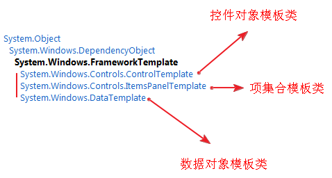
由上图可知,控件对象模板,项集合模板和数据对象模板都是继承自FrameworkTemplate类,
1. ControlTemplate主要用于自定义控件的操作行为和视图结构的外观显示效果。如:当按钮按下时如何显示等,按钮上要不要同时显示图片和文本。
- 通过设置控件的Template属性(继承自Control)来应用自定义的ControlTemplate
- ItemsPanelTemplate主要用于自定义带有列表项的控件中各子控件的布局外观显示效果,如:ListBox中的列表项怎样对布局。
- 通过设置控件的ItemsPanel属性来应用自定义的ItemsPanelTemplate
- DataTemplate主要用于自定义内容控件中的数据视图效果,如:ListBox中每一项显示什么数据。
- 通过设置控件的ItemTemplate /ContentTemplate属性来应用自定义的DataTemplate,注意:一个控件上可能应用多个自定义模板,如:ListBox设置ListBox的列表项Items为横向排列,设置每个列表项里布局和数据,这样就要设置ListBox的ItemsPanelTemplate和DataTemplate。
原创地址:http://blog.csdn.net/mr_raptor/article/details/7251948
ControlTemplate类
定义控件的视图显示模板,从而可以对控件进行自定义。在模板内可以构建自己的控件对象树。
注意:
- 如果您正在定义一个控件模板来取代一个现有控件类的模板,则您用于定义控件模板内容的 XAML 应与现有的控件匹配。否则,该控件可能无法在用户界面中正常发挥作用。
- 不能将 ControlTemplate 应用于 UserControl(上一节有说明为什么)。
例如:为 Button 创建一个简单的 ControlTemplate。控件模板包含一个Grid 并指定以下行为:
· 当用户将鼠标悬停在Button 上方时,Grid 在半秒之后从绿色变为红色。
· 当用户将鼠标移离按钮时,Grid 立即变回到绿色。
<ControlTemplate TargetType="Button">
  <Grid >
    <VisualStateManager.VisualStateGroups>
      <VisualStateGroup x:Name="CommonStates">
        <VisualStateGroup.Transitions>
          <!--Take one half second to trasition to the MouseOver state.-->
          <VisualTransition To="MouseOver" GeneratedDuration="0:0:0.5"/>
        </VisualStateGroup.Transitions>
        <VisualState x:Name="Normal" />
        <!--Change the SolidColorBrush, ButtonBrush, to red when the
            mouse is over the button.-->
        <VisualState x:Name="MouseOver">
          <Storyboard>
            <ColorAnimation Storyboard.TargetName="ButtonBrush"
		Storyboard.TargetProperty="Color" To="Red" />
          </Storyboard>
        </VisualState>
      </VisualStateGroup>
    </VisualStateManager.VisualStateGroups>
    <Grid.Background>
      <SolidColorBrush x:Name="ButtonBrush" Color="Green"/>
    </Grid.Background>
  </Grid>
</ControlTemplate>
ItemsPanelTemplate 类
ItemsPanelTemplate定义ItemsControl中的Item项布局的模板。ItemsControl 的默认值是一个指定StackPanel的ItemsPanelTemplate。例如:ListBox是一个ItemsControl子控件,它的Item项布局模板ItemsPanelTemplate为默认的StackPanel,而StackPanel默认布局是垂直布局,因此,默认的ListBox的Item项垂直布局的,当我们向ListBox里添加Item时,都是垂直列表形式,如果你想要自定义你的ListBox风格为水平显示,那么将要自定义ItemsPanelTemplate里StackPanel为水平方向。
如下例,将ListBox的风格改为水平子项显示方式。
模板XAML:
<Grid>
  <Grid.Resources>
    <Style x:Key="horizontalListBoxStyle" TargetType="ListBox">
      <Setter Property="ItemsPanel">
        <Setter.Value>
          <ItemsPanelTemplate>
            <StackPanel Orientation="Horizontal"
              VerticalAlignment="Center"
              HorizontalAlignment="Center"/>
          </ItemsPanelTemplate>
        </Setter.Value>
      </Setter>
    </Style>
<src:Items x:Key="items"/>
  </Grid.Resources>
  <ListBox ItemsSource="{StaticResource items}"
           Style="{StaticResource horizontalListBoxStyle}"/>
</Grid>
C#代码:
public class Items :
    System.Collections.ObjectModel.ObservableCollection<string>
{
    public Items()
    {
        Add("Item 1");
        Add("Item 2");
        Add("Item 3");
        Add("Item 4");
        Add("Item 5");
    }
}
显示效果如下:

总结:
ItemsPanelTemplate主要用于带有Item项的控件风格布局模板设置,常见的控件就是ListBox,
原创地址:http://blog.csdn.net/mr_raptor/article/details/7251948
DataTemplate 类
用于定义内容控件内数据对象的可视结构模板。虽然内容控件只能包含一个UIElement,但是,它可以包含一个容器控件,从而可以间接的包含多个子控件,而DataContent就是为这些容器控件里的子控件进行布局的模板类。
下面的例子,自定了ListBox中每一项中的UI如何表现。每一个Item中包含四个水平布局的TextBlock控件,每个TextBlock控件都绑定了Customers的属性。
XAML:
<Grid>
    <Grid.Resources>
        <src:Customers x:Key="customers"/>
    </Grid.Resources>

    <ListBox ItemsSource="{StaticResource customers}" Width="350" Margin="0,5,0,10">
        <ListBox.ItemTemplate>
            <DataTemplate>
                <StackPanel Orientation="Horizontal">
                    <TextBlock Padding="5,0,5,0"
                       Text="{Binding FirstName}" />
                    <TextBlock Text="{Binding LastName}" />
                    <TextBlock Text=", " />
                    <TextBlock Text="{Binding Address}" />
                </StackPanel>
            </DataTemplate>
        </ListBox.ItemTemplate>
    </ListBox>
</Grid>
C#:
public class Customer
{
    public String FirstName { get; set; }
    public String LastName { get; set; }
    public String Address { get; set; }

    public Customer(String firstName, String lastName, String address)
    {
        this.FirstName = firstName;
        this.LastName = lastName;
        this.Address = address;
    }
}

public class Customers : ObservableCollection<Customer>
{
    public Customers()
    {
        Add(new Customer("Michael", "Anderberg",
                "12 North Third Street, Apartment 45"));
        Add(new Customer("Chris", "Ashton",
                "34 West Fifth Street, Apartment 67"));
        Add(new Customer("Cassie", "Hicks",
                "56 East Seventh Street, Apartment 89"));
        Add(new Customer("Guido", "Pica",
                "78 South Ninth Street, Apartment 10"));
    }
}
二、其它
原创地址:http://blog.csdn.net/mr_raptor/article/details/7251948
DataContext类
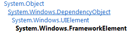
DataContext是FrameworkElement的属性,是Object类型,用于获取或设置 FrameworkElement 参与数据绑定时的数据上下文。也就是说它是被数据绑定的对象。
DataContext也就是第四代控件祖宗的属性(说实话,控件从第三代祖宗UIElement开始才有了外观,有了点人样),
如果你给它绑定了数据源,CLR就会从数据源里拿出对应数据用于显示,DataContext有传递性,如果外部包含控件设置了DataContext,被包含控件没有设置该属性,则被包含控件也可以使用外部包含控件的DataContext。
比如:
XAML:
<phone:PhoneApplicationPage.Resources>
            <local:WeiBoData x:Key="MyWeiBoData"/>
</phone:PhoneApplicationPage.Resources>

<Grid x:Name="LayoutRoot" Background="Transparent"  DataContext="{StaticResource MyWeiBoData}">
        <StackPanel Grid.Row="0" Margin="12,17,0,28">
            <TextBlock x:Name="DateTextBlock" Text="{Binding WeiBoDate}" >
            <TextBlock x:Name="TitleTextBlock" Text="{Binding WeiBoTitle}" />
        </StackPanel>
</Grid>
WeiBoData类中包含有WeiBoDate属性和WeiBoTitle属性,虽然没有指定两个TextBlock的绑定对象,但是它有Grid控件的DataContext。
在后续两节,我们分别以这两节的知识,分享两个例子:
自定义水印密码输入控件和下拉刷新控件。
注:上述两个控件经常使用,并且方便快捷。
本文系本站原创,欢迎转载! 转载请注明出处: