内联子标题
< small > 设置文本为父文本大小的 85%
< strong > 设置文本为更粗的文本
< em >设置文本为斜体
P标签的样式:
"lead":文本更大更粗、行高更高
"text-left":向左对齐
"text-center":居中对齐
"text-right":向右对齐
"text-justify":设定文本对齐,段落中超出屏幕部分文字自动换行
"text-muted":文本内容减弱
(不同的字体颜色)
"text-primary":primary class
"text-success":success class
"text-info":info class
"text-warning":warning class
"text-danger":danger class
举例说明:
<!DOCTYPE html>
<html>
<head>
    <meta charset = "utf-8">
    <title>Bootstrap 实例 - 上下文类</title>
    <link href="bootstrap-3.3.4-dist/css/bootstrap.min.css" rel="stylesheet">
    <style type="text/css">
        body{padding: 20px;}
    </style>
</head>
<body>
    <div class = "container">
        <div class="row">
            <div class="col-lg-6 col-lg-offset-2" style="background:#F1FFF4;padding:20px;">
                <p>这是一行普通文字</p>
                <p class="lead">这是带有lead类的文字(加粗加大行高更多,line-height:1.4;font-weight:300;margin-bottom:20px;)</p>
                <p class="text-center">这是带有text-center类的文字(居中对齐,text-align: center;)</p>
                <p class="text-right">这是带有text-right类的文字(局右对齐,text-align: right;)</p>
                <p class="text-justify">这是带有text-justify类的文字(text-align: justify)</p>
                <p class="text-muted">这是带有text-muted类的文字(减弱,color:#777)</p>

                <p class="text-primary">这是带有text-primary类的文字(color: #337AB7)</p>
                <p class="text-success">这是带有text-success类的文字(color: #3C763D)</p>
                <p class="text-info">这是带有text-info类的文字(color: #31708F)</p>
                <p class="text-warning">这是带有text-warning类的文字(color: #8A6D3B)</p>
                <p class="text-danger">这是带有text-danger类的文字(color: #A94442)</p>
            </div>
        </div>
    </div>
</body>
</html>
效果如下:
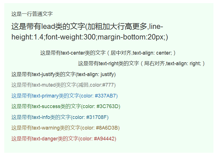
图中详细说明了每一种class的样式,当然如果默认样式不是自己想要的,完全可以更改bootstrap.min.css文件。
缩写HTML 元素提供了用于缩写的标记,比如 WWW 或 HTTP。Bootstrap 定义 元素的样式为显示在文本底部的一条虚线边框,当鼠标悬停在上面时会显示完整的文本( title
属性中的内容)。添加 .initialism 到 ,会得到较小的字体。
<!DOCTYPE html>
<html>
<head>
    <meta charset = "utf-8">
    <title>Bootstrap 实例 - 上下文类</title>
    <link href="bootstrap-3.3.4-dist/css/bootstrap.min.css" rel="stylesheet">
    <style type="text/css">
        body{padding: 20px;}
    </style>
</head>
<body>
    <div class = "container">
        <div class="row">
            <div class="col-lg-4 col-lg-offset-2" style="background:#F1FFF4;padding:20px;">
                <abbr title="World Wide Web">WWW</abbr><br>
                <abbr title="Small Office Home Office">SOHO</abbr>
            </div>
        </div>
    </div>
</body>
</html>
效果如下:
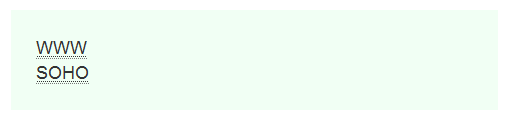
当鼠标悬停在WWW或者是SOHO上时,鼠标右下方会出现一个?号,并且会显示abbr的title属性中的值,
如WWW右下角显示(World Wide Web),SOHO右下角显示(Small Office Home Office)
地址(Address)
< address > 默认为 display:block;需要使用标签来为封闭的地址文本(当地址文本使用的是strong,abbr,a这些行内元素时)添加换行。
< address >标签并无特殊之处,其默认的CSS样式为:
address {
    margin-bottom: 20px;
    font-style: normal;
    line-height: 1.42857;
}
引用(Blockquote)可以在任意的 HTML文本旁使用默认的 < blockquote >,其他选项包括,添加一个 < small > 标签来标识引用的来源,
使用class .pull-right 向右对齐引用。
例如:
<!DOCTYPE html>
<html>
<head>
    <meta charset = "utf-8">
    <title>Bootstrap 实例 - 上下文类</title>
    <link href="bootstrap-3.3.4-dist/css/bootstrap.min.css" rel="stylesheet">
    <style type="text/css">
        body{padding: 20px;}
    </style>
</head>
<body>
    <div class = "container">
        <div class="row">
            <div class="col-lg-6 col-lg-offset-2" style="background:#F1FFF4;padding:20px;">
               <blockquote>
                    <p>这是一个默认的引用实例。</p>
                </blockquote>
                <blockquote>这是一个带有源标题(title = "Source Title")的引用。
                    <small>Someone famous in
                        <cite title="Source Title">Source Title</cite>
                    </small>
                </blockquote>
                <blockquote class="pull-right">这是一个向右对齐(class = "pull-right")的引用(带有原标题)。
                    <small>Someone famous in
                        <cite title="Source Title">Source Title</cite>
                    </small>
                </blockquote>
            </div>
        </div>
    </div>
</body>
</html>
效果如下: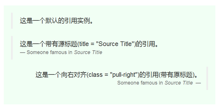
pull-right的样式:
blockquote.pull-right {
    padding-right: 15px;
    padding-left: 0px;
    text-align: right;
    border-right: 5px solid #EEE;
    border-left: 0px none;
    float: right !important;
}
列表Bootstrap 支持有序列表、无序列表和定义列表。
有序列表:有序列表是指以数字或其他有序字符开头的列表(ol/li)。
无序列表:无序列表是指没有特定顺序的列表,是以传统风格的着重号开头的列表。如果您不想显示这些着重号,您可以使用 class .list-unstyled 来 移除样式。您也可以通过使用 class .list-inline 把所有的列表项放在同一行中(ul/li)。
定义列表:在这种类型的列表中,每个列表项可以包含 < dt > 和 < dd > 元素。< dt > 代表 定义术语,就像字典,这是被定义的属于(或短语)。 接着,< dd > 是 < dt > 的描述。可以使用 class dl-horizontal 把 < dl > 行中的属于与描述并排显示。
<!DOCTYPE html>
<html>
<head>
    <meta charset = "utf-8">
    <title>Bootstrap 实例 - 上下文类</title>
    <link href="bootstrap-3.3.4-dist/css/bootstrap.min.css" rel="stylesheet">
    <style type="text/css">
        body{padding: 20px;}
    </style>
</head>
<body>
    <div class = "container">
        <div class="row">
            <div class="col-lg-6 col-lg-offset-2" style="background:#F1FFF4;padding:20px;">
                <h4>有序列表</h4>
                    <ol>
                      <li>Item 1</li>
                      <li>Item 2</li>
                      <li>Item 3</li>
                      <li>Item 4</li>
                    </ol>
                    <h4>无序列表</h4>
                    <ul>
                      <li>Item 1</li>
                      <li>Item 2</li>
                      <li>Item 3</li>
                      <li>Item 4</li>
                    </ul>
                    <h4>无样式列表(list-unstyled)</h4>
                    <ul class="list-unstyled">
                      <li>Item 1</li>
                      <li>Item 2</li>
                      <li>Item 3</li>
                      <li>Item 4</li>
                    </ul>
                    <h4>内联列表(list-inline)</h4>
                    <ul class="list-inline">
                      <li>Item 1</li>
                      <li>Item 2</li>
                      <li>Item 3</li>
                      <li>Item 4</li>
                    </ul>
                    <h4>定义列表</h4>
                    <dl>
                      <dt>Description 1</dt>
                      <dd>Item 1</dd>
                      <dt>Description 2</dt>
                      <dd>Item 2</dd>
                    </dl>
                    <h4>水平的定义列表</h4>
                    <dl class="dl-horizontal">
                      <dt>Description你好你好你好你好你好1</dt>
                      <dd>Item 1</dd>
                      <dt>Description 2</dt>
                      <dd>Item 2</dd>
                    </dl>
            </div>
        </div>
    </div>
</body>
</html>
效果如下:
关于样式做一点说明:
无样式列表:
.list-unstyled {
    padding-left: 0px;
    list-style: outside none none;
}

内联列表:
.list-inline {
    padding-left: 0px;
    margin-left: -5px;
    list-style: outside none none;
}
水平的定义列表
.dl-horizontal dt {
    float: left;
    width: 160px;
    overflow: hidden;
    clear: left;
    text-align: right;
    white-space: nowrap;
    text-overflow: ellipsis;
}

white-space:nowrap;强制不换行
text-overflow:ellipsis:文字超出部分显示为省略号