CSS文本属性复习
1、white-space:对象内空格的处理方式
2、direction:文本流的方向
3、unicode-bidi:用于同一个页面里存在从不同方向读进的文本显示。与direction属性一起使用
1.white-space:对象内空格的处理方式
nowrap 控制文本不换行
pre 空白会被浏览器保留
normal 默认状态
pre-line 合并空白 保留换行符
pre-wrap 保留空白 正常换行
nowrap经常配合text-overflow一起使用,使得超出部分显示为省略号,主要overflow一定要设置为hidden,如下:
<!DOCTYPE html>
<html lang="en">
<head>
    <meta charset="UTF-8">
    <title></title>
    <style>
        p{
            width: 200px;font-size: 20px;
            white-space: nowrap;text-overflow: ellipsis;overflow: hidden;
        }
    </style>
</head>
<body>
   <p title="被包围在pre元素中的文本通常会保留空格和换行符。而文本也会呈现为等宽字体">
       被包围在pre元素中的文本通常会保留空格和换行符。而文本也会呈现为等宽字体</p>
</body>
</html>
效果如下图所示: 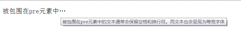
还可以在样式中增加p:hover{normal;}这样正常状态下超出部分显示省略号,而鼠标悬停在p之上时,显示完整内容。
再看下其它的几个属性:
<!DOCTYPE html>
<html lang="en">
<head>
    <meta charset="UTF-8">
    <title></title>
    <style>
        p{width: 400px;font-size: 18px; background: #CBFF8F;line-height: 36px;}
        .pre{white-space: pre;/*空白被浏览器保留*/}
        .pre-line{white-space: pre-line;/*合并空白,保留换行符*/}
        .pre-wrap{white-space: pre-wrap;/*保留空白,正常换行*/}
    </style>
</head>
<body>
    <p class="pre">    在理解this绑定之前,    先要理解调用位置。
        我们可以通过浏览器的调试工具来查看调用栈。
        在第一行代码钱插入一条debugger;</p>

    <p class="pre-line">    在理解this绑定之前,    先要理解调用位置。
        我们可以通过浏览器的调试工具来查看调用栈。
        在第一行代码钱插入一条debugger;</p>

    <p class="pre-wrap">    在理解this绑定之前,    先要理解调用位置。
        我们可以通过浏览器的调试工具来查看调用栈。
        在第一行代码钱插入一条debugger;</p>
    <p class="normal">    在理解this绑定之前,    先要理解调用位置。
        我们可以通过浏览器的调试工具来查看调用栈。
        在第一行代码钱插入一条debugger;</p>
</body>
</html>
效果图如下: 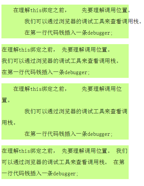
如果元素内容未超出范围,pre和pre-wrap的效果是一样的,只有超出范围时,才有区别,pre是不会自动换行的,而pre-wrap到元素边界处,自动换行。
2、direction:文本流的方向
ltr 文本从左向右
rtl 文本从右往左
<html lang="en">
<head>
    <meta charset="UTF-8">
    <title></title>
    <style>
        p{background: #e3e3e3;padding: 5px; width: 200px;}
        .left{direction: ltr;}
        .right{direction: rtl;}
    </style>
</head>
<body>
    <p class="left">文本流的方向</p>
    <p class="right">文本流的方向</p>
    <p>文本流的方向</p>
</body>
</html>
效果: 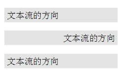
3、unicode-bidi:用于同一个页面里存在从不同方向读进的文本显示。 与direction属性一起使用
bidi-override 严格按照 属性的值重排序。忽略隐式双向运算规则。
unicode-bidi默认的属性值为normal,此外,在CSS3中还增加了另外几个属性值: isolate 、 isolate-override 、plaintext
仅举例说明bidi-override:(unicode-bidi属性在项目中使用频率很低)
<!DOCTYPE html>
<html lang="en">
<head>
    <meta charset="UTF-8">
    <title></title>
    <style>
        p{background: #e3e3e3;padding: 5px; width: 200px;}
        .left{direction: ltr;unicode-bidi: bidi-override;}
        .right{direction: rtl;unicode-bidi: bidi-override;}
    </style>
</head>
<body>
    <p class="left">文本流的方向</p>
    <p class="right">文本流的方向</p>
</body>
</html>
效果如下: 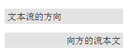
CSS3新增文本属性
1、color:rgba();
2、text-overflow:是否使用一个省略标记(…)标示对象内文本的溢出
3、text-align:文本的对齐方式
4、text-transform:文字的大小写
5、text-decoration:文本的装饰线,复合属性
6、text-shadow:文本阴影
7、text-fill-color:文字填充颜色
8、text-stroke:复合属性。设置文字的描边
9、tab-size:制表符的长度
10、word-wrap:当前行超过指定容器的边界时是否断开转行
1、rgba()
r red 红色 0-255
g green 绿色 0-255
b blue 蓝色 0-255
a alpha 透明 0-1
rgba比rgb增加了一个透明度,此前我们使用opacity设置透明度,但是使用opacity会使得文字也变得透明,而rgba则不会,如下:
<!DOCTYPE html>
<html lang="en">
<head>
    <meta charset="UTF-8">
    <title></title>
    <style>
        div{font-size: 24px; width: 200px; font-weight: 600; margin: 20px;
            height: 200px; line-height: 200px;text-align: center;float: left;}
        .div1{background:rgb(0,146,255); opacity: 0.5;}
        .div2{background: rgba(0,146,255,0.5);}
        .img{width:400px;height:300px;
            background: url(../images/photo2.jpg) center;
            border: 25px solid rgba(0,0,0,0.6);}

    </style>
</head>
<body>
    <div class="div1">文本属性</div>
    <div class="div2">文本属性</div>
    <div class="img"></div>
</body>
</html>
效果: 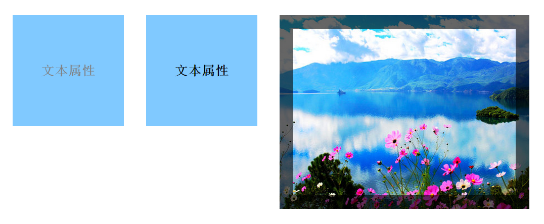
2、text-overflow:是否使用一个省略标记(…)标示对象内文本的溢出
clip: 默认值 无省略号
ellipsis:当对象内文本溢出时显示省略标记(…)。
注意:该属性需配合over-flow:hidden属性(超出处理)还有white-space:nowrap(禁止换行)配合使用,否则无法看到效果
这部分在前面讲white-space时已有例子。
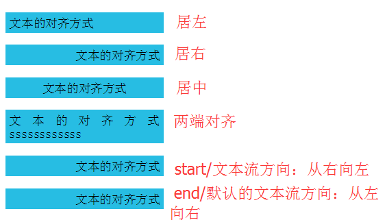
3、text-align:文本的对齐方式
css1
left:默认值 左对齐
right:右对齐
center:居中
justify: 内容两端对齐。
css3
start:开始边界对齐
end:结束边界对齐
(跟文本流方向有关,如果文本流的方向为自右向左,那么start就是右侧,end就是左侧)
<!DOCTYPE html>
<html lang="en">
<head>
    <meta charset="UTF-8">
    <title></title>
    <style>
        p{width:200px;background: #27bde3;padding: 5px;}
        .left{text-align: left;}
        .right{text-align: right;}
        .center{text-align: center;}
        .justify{text-align: justify;}
        .start{text-align: start; direction: rtl;}
        .end{text-align: end;}
    </style>
</head>
<body>
    <p class="left">文本的对齐方式</p>
    <p class="right">文本的对齐方式</p>
    <p class="center">文本的对齐方式</p>
    <p class="justify">文本的对齐方式ssssssssssss</p>
    <p class="start">文本的对齐方式</p>
    <p class="end">文本的对齐方式</p>
</body>
</html>
4、text-transform:文字的大小写
css1
none: 默认值 无转换
capitalize: 将每个单词的第一个字母转换成大写
uppercase: 转换成大写
lowercase: 转换成小写
css3
full-width: 将左右字符设为全角形式。不支持
full-size-kana:将所有小假名字符转换为普通假名。不支持
例如:土耳其语。
这几个属性值都可以从描述中清晰的看出其用途,不做举例说明
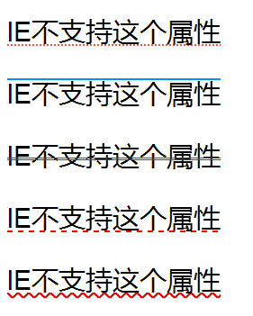
5、text-decoration:文本的装饰线,复合属性
text-decoration-line :指定文本装饰的种类。相当于CSS1时的text-decoration属性
none:指定文字无装饰
underline: 指定文字的装饰是下划线
overline:指定文字的装饰是上划线
line-through: 指定文字的装饰是贯穿线
text-decoration-style :指定文本装饰的样式。
solid:实线
double:双线
dotted:点状线条
dashed:虚线
wavy:波浪线
text-decoration-color:指定文本装饰的颜色。
用法:text-decoration : #F00 double overline
<!DOCTYPE html>
<html lang="en">
<head>
    <meta charset="UTF-8">
    <title></title>
    <style>
        p{font-size: 24px;}
        .under{text-decoration: #FA4C41 dotted underline;}
        .over{text-decoration: #0092ff solid overline;}
        .through{text-decoration: #FF0000 double line-through;}
        .dashed{text-decoration: #FF0000 dashed underline;}
        .wavy{text-decoration: #FF0000 wavy underline;}
    </style>
</head>
<body>
    <p class="under">IE不支持这个属性</p>
    <p class="over">IE不支持这个属性</p>
    <p class="through">IE不支持这个属性</p>
    <p class="dashed">IE不支持这个属性</p>
    <p class="wavy">IE不支持这个属性</p>
</body>
</html>
6、text-shadow:文本阴影
取值:x y blur color,……
x 横向偏移
y 纵向偏移
blur 模糊距离(灰度)
color 阴影颜色
<!DOCTYPE html>
<html lang="en">
<head>
    <meta charset="UTF-8">
    <title></title>
    <style>
        p{text-align:center;font:50px/50px "微软雅黑";/*字体:字体大小/行高*/}
        .p1{font-weight:600; text-shadow: 5px 4px 8px #766F5A;}
        .p2{color:#FFF;text-shadow:2px 3px 4px #000;/**/}
        .p3{color: #FFF; text-shadow: 0 0 20px #FF79C3, 0 0 30px  #71FF5B,0 0 50px  #FF0000,0 0 80px #FF0000;}
    </style>
</head>
<body>
    <p class="p1">文本阴影</p>
    <p class="p2">浮雕效果</p>
    <p class="p3">光影效果</p>
</body>
</html>

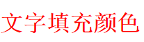
7、text-fill-color:文字填充颜色
兼容性不好,目前仅谷歌支持。
<!DOCTYPE html>
<html lang="en">
<head>
    <meta charset="UTF-8">
    <title></title>
    <style>
        p{-webkit-text-fill-color:red;font-size:30px;font-weight: 600;}
    </style>
</head>
<body>
    <p>文字填充颜色</p>
</body>
</html>
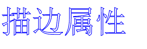
8、text-stroke:复合属性。设置文字的描边
text-stroke-width:文字的描边厚度
text-stroke-color:文字的描边颜色
<!DOCTYPE html>
<html lang="en">
<head>
    <meta charset="UTF-8">
    <title></title>
    <style>
        p{font-size:100px;-webkit-text-fill-color: transparent;
            -webkit-text-stroke: 2px blue;}
    </style>
</head>
<body>
    <p>描边属性</p>
</body>
</html>
9、tab-size:制表符的长度
默认值为8(一个tab键的空格字节长度),在pre标签之内才会有显示
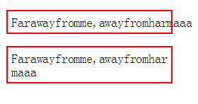
10、word-wrap:当前行超过指定容器的边界时是否断开转行
normal: 默认值
允许内容顶开或溢出指定的容器边界。
break-word:
内容将在边界内换行。如果需要,单词内部允许断行。
<!DOCTYPE html>
<html lang="en">
<head>
    <meta charset="UTF-8">
    <title></title>
    <style>
        p{width:200px;border:2px solid #FF0000;padding: 5px;}
        .p1{word-wrap: normal}
        .p2{word-wrap: break-word;}
    </style>
</head>
<body>
    <p class="p1">Farawayfromme,awayfromharmaaa</p>
    <p class="p2">Farawayfromme,awayfromharmaaa</p>
</body>
</html>
鉴于CSS3的兼容性问题,可以在caniuse网站进行查询,以明确其支持的浏览器版本。
http://caniuse.com/